MFA Dashboard
The MFA Dashboard shows a summary of current multi-factor authentication (MFA) activity, SMS and voice usage and costs, and user devices.
You can limit the data to a specific time range, authentication method, status, or device OS with filters.
To access the MFA Dashboard, in the PingOne admin console, go to Monitoring > MFA Dashboard.
The dashboard is organized into MFA, SMS/Voice, and User Devices tabs.
Filters
Use filters to refine the data displayed on the dashboard. All filters listed on a tab apply to all charts displayed on that tab.
| Filter | Description | Chart |
|---|---|---|
Time range |
Filters data by the time range. Options include Last 24 hours, Last 7 days, Last 30 days, and Custom range. |
|
Authentication method |
Filters data by authentication method. Options include Mobile App, SMS, or WhatsApp. You can select multiple values. |
|
Status |
Filters data by authentication success status. Options include SUCCESS, FAILURE, or Both. |
|
Mobile app platform |
Filters data by the mobile application’s operating system. Options include Android and IOS. |
|
Notification type |
Filters data by the type of notification. Options include Authentication, Registration, General, or All notifications. |
|
Country |
Filters cost and usage data by destination country. You can select All Countries or choose a specific country from the list. |
|
Device Role |
Filters data by device role. Options include Primary (default) to view data for a user’s default authentication method, Secondary for secondary authentication methods, or Both. |
|
Charts
The charts display activity data, which is subject to a refresh delay.
You can use the following control to adjust the charts:
| Icon | Name | Description |
|---|---|---|

|
Maximize |
Expands the charts to fill the dashboard. |
Click the MFA, SMS/Voice, and User Devices tabs to view their charts.
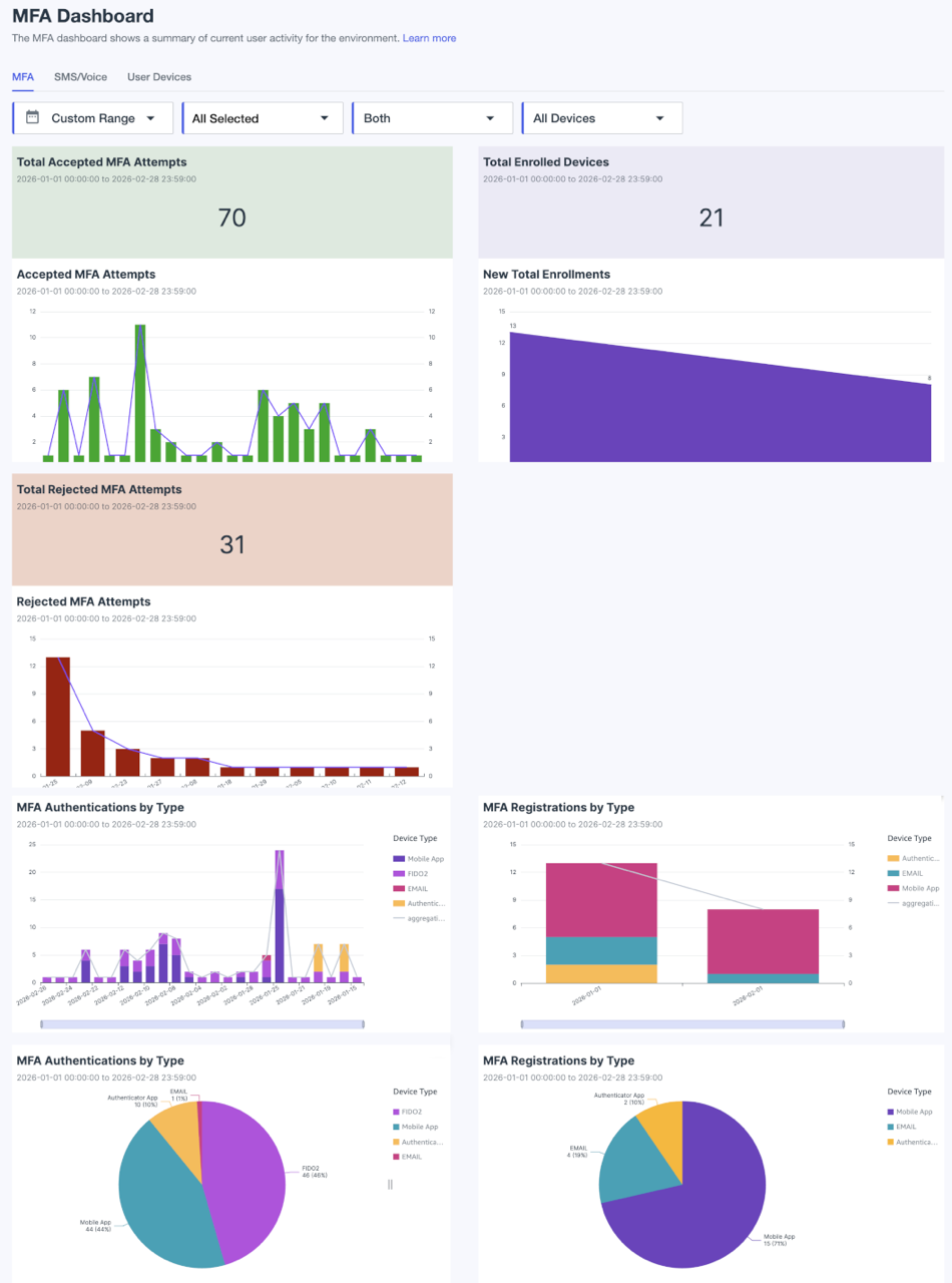
MFA
The MFA charts help you understand your organization’s MFA activity. Use them to track successful and failed authentications, monitor new device enrollments, and see a breakdown of which authentication methods are being used.
Total Accepted MFA Attempts
Displays the total successful MFA authentications for the selected time period by selected authentication method, status, and mobile platform.
Accepted MFA Attempts
Displays a daily count of successful MFA attempts for the selected time period by selected authentication method, status, and mobile platform. Each bar represents a single day’s total. The line connecting the bars shows the trend over time.
Total Rejected MFA Attempts
Displays the total rejected MFA authentications for the selected time period by selected authentication method, status, and mobile platform.
Rejected MFA Attempts
Displays a bar chart of failed MFA attempts per day for the selected time period by selected authentication method, status, and mobile platform. Each bar represents the daily aggregation count. The line connecting the bars shows the trend over time.
Total Enrolled Devices
Displays the number of enrolled devices for the selected time period by selected authentication method, status, and mobile platform.
New Total Enrollments
Shows a bar chart of new MFA enrollments that occurred for the selected time period by selected authentication method, status, and mobile platform.
MFA Authentication by Type
Displays the distribution of MFA authentications in two ways:
-
A stacked bar chart shows the trend of authentications over time, broken down by authentication method.
-
A pie chart provides a snapshot of the total authentications, showing the proportion of each authentication method.
The Device Type key shows the color assigned to each authentication method. Click and drag the handles on the horizontal time bar to adjust the displayed time range.
MFA Registrations by Type
Displays MFA registrations in two ways:
-
A stacked bar chart shows the trend of registrations over time, broken down by authentication method.
-
A pie chart provides a snapshot of registrations, showing the proportion of each authentication method.
The Device Type key shows the color assigned to each authentication method. Click and drag the handles on the horizontal time bar to adjust the displayed time range.
SMS/Voice
The SMS/Voice charts provide a breakdown of usage and, where available, cost data for SMS and voice notifications. The data is aggregated from report logs and sources from your custom sender integrations. You can filter this data by time period, notification type, status, and country.
Learn more about custom SMS and voice sender integrations in Configuring an SMS/Voice sender account with PingOne.
|
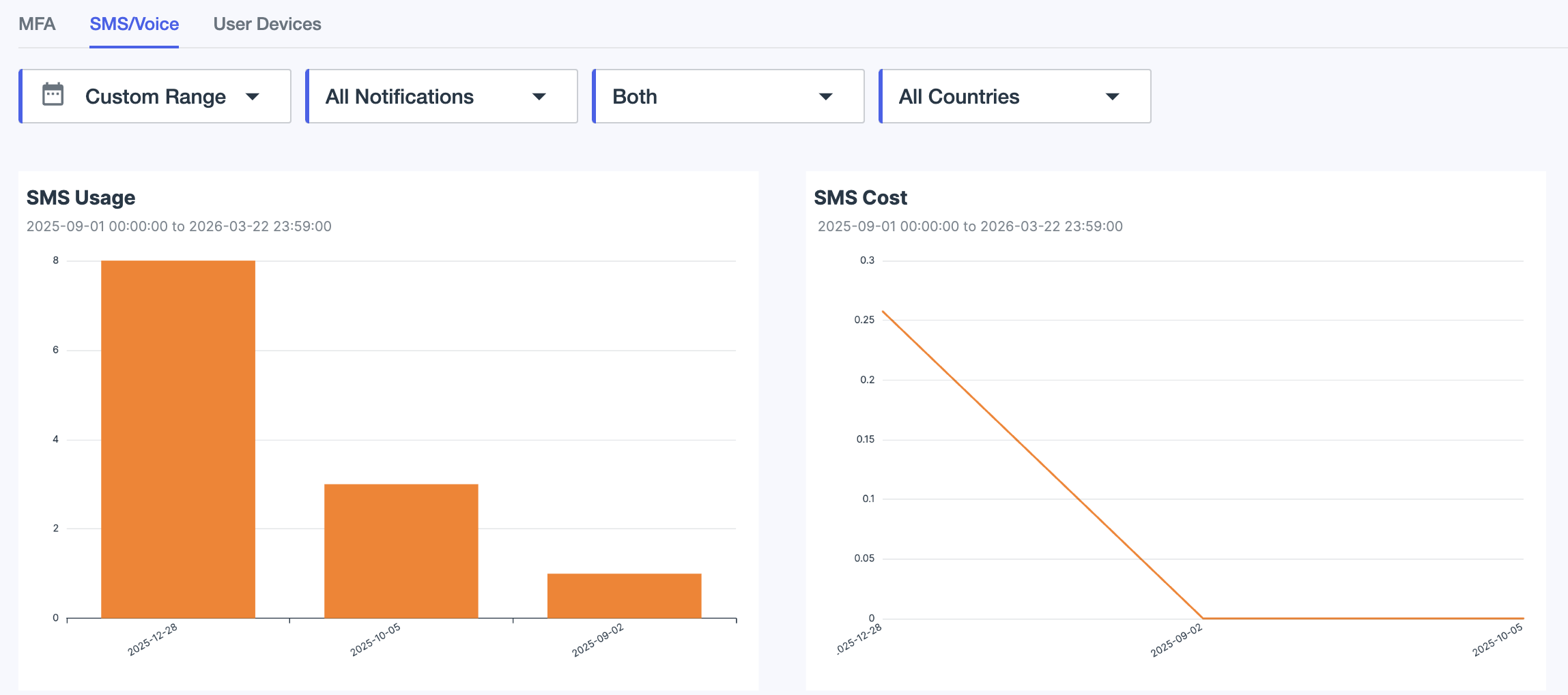
SMS Usage
Displays the SMS usage in a bar chart, broken down by time range, notification type, status, and country.
SMS Cost
Displays the SMS usage cost breakdown over time in a line graph by time range, notification type, status, and country.
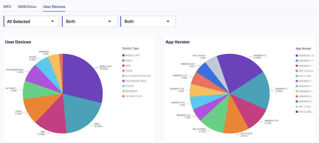
User Devices
The User Devices charts show the distribution of user devices by authentication method and mobile app version. For the app version chart, only the authentication method Mobile app is relevant.