Dashboard
On the PingOne DaVinci dashboard, use the graphs to view your current end-user activity levels.
Overview
Hover over data points to see specific information or click the Maximize (![]() ) icon for an individual graph to expand the appearance.
) icon for an individual graph to expand the appearance.
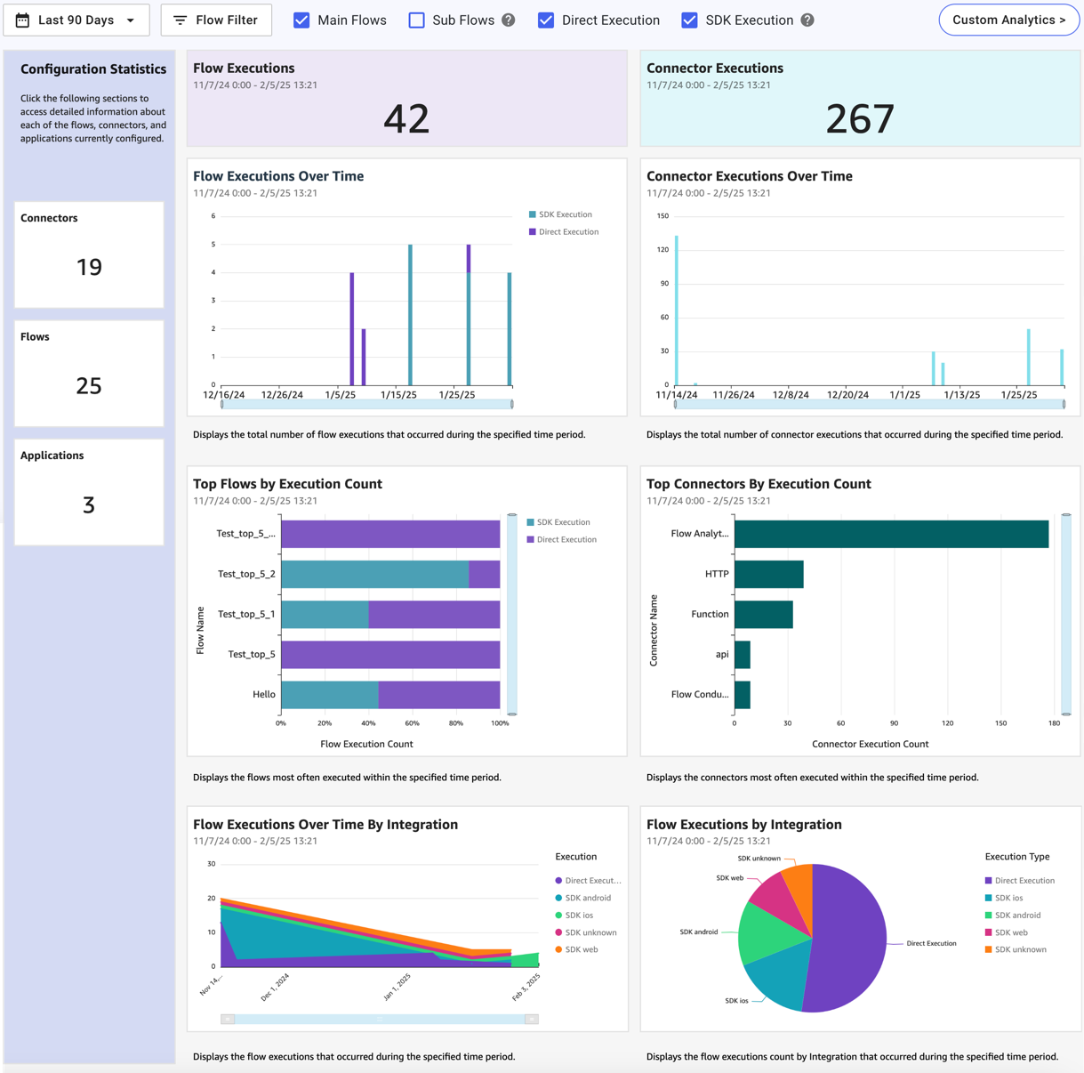
Use the checkbox options to filter the flow executions that are included in the flow statistics:
-
Main Flows includes flows that are not invoked by another flow.
-
Sub Flows includes flows that are invoked by another flow.
-
Direct Flows includes flows that are invoked using a redirect, the widget, or an API call.
-
SDK Flows includes flows that are invoked using the SDK. Learn more about the supported SDKs in Launching a flow with a Ping SDK.
The connector statistics ignore these selections and count all connector executions across all flows.
Click the date picker to select date ranges or create custom ones. Click and drag the horizontal and vertical sliders to adjust the ranges. The currently selected data range is displayed at the top of each section.
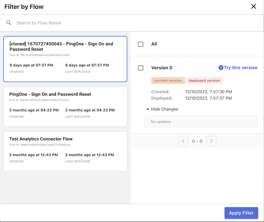
Click Flow Filter to open the Filter by Flow window. Here you can select specific flows and versions of flows to filter the data in the graphs by.
You can also use the following icons to adjust any changes to the dashboard.
| Icon | Description |
|---|---|

|
Reset to original dashboard. |

|
Undo |

|
Redo |

|
Export |
|
To view flow outcome data gathered using the Flow Analytics connector, click Custom Analytics. |
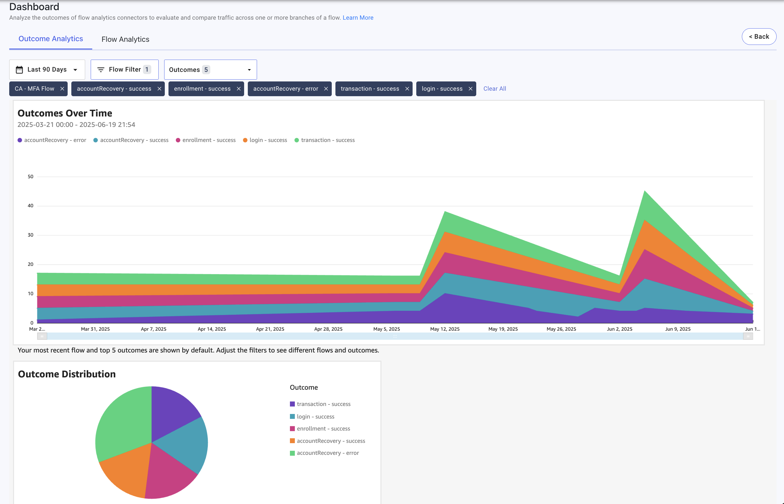
The data in the Custom Analytics Results section is populated using custom flow analytics connectors.
The Outcome Analytics tab lets you view data about a selected flow’s outcomes. The Outcomes Over Time chart shows the outcome numbers for each day and Outcome Distribution chart shows the relative occurrence of each outcome during the selected period of time.
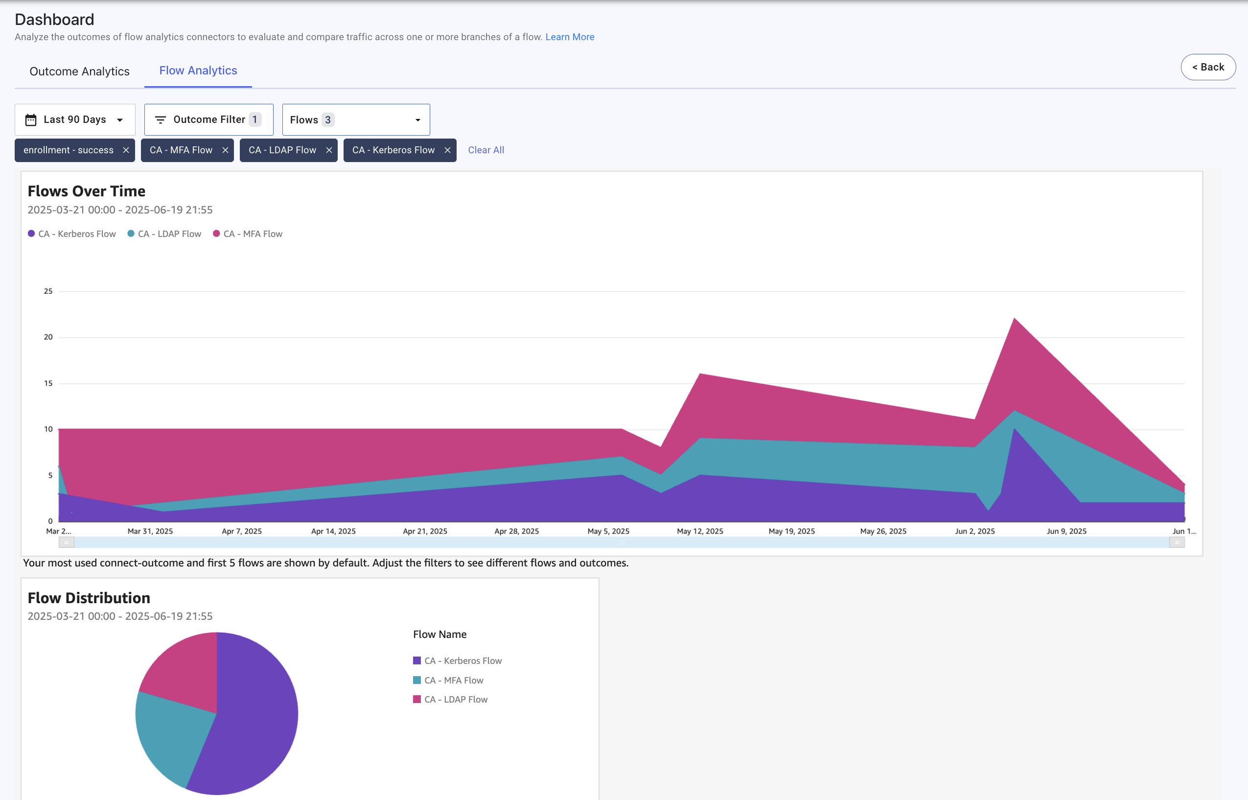
The Flow Analytics tab lets you view data about a selected outcome in multiple flows. The Flows Over Time chart shows the number of times the outcome occurred in each flow for each day, and the Flow Distribution chart shows the relative occurrence of each flow reaching the outcome during the selected period of time.
On both tabs, you can use the Date Range, Flow Filter, and Outcomes selectors to adjust the content displayed in the charts. Click Back to return to the main dashboard.
Configuration Statistics
Configuration Statistics displays an overview of the number of active connectors, flows, and applications currently configured.
Click the Connectors, Flows, or Applications sections to view those configurations in a new tab.
Flow Executions
Flow Executions displays the total number of flow executions for the selected time period.
Flow Executions Over Time
Flow Executions Over Time displays the number of flow executions per day for the selected time period. Hover over each bar to view more specific data points.
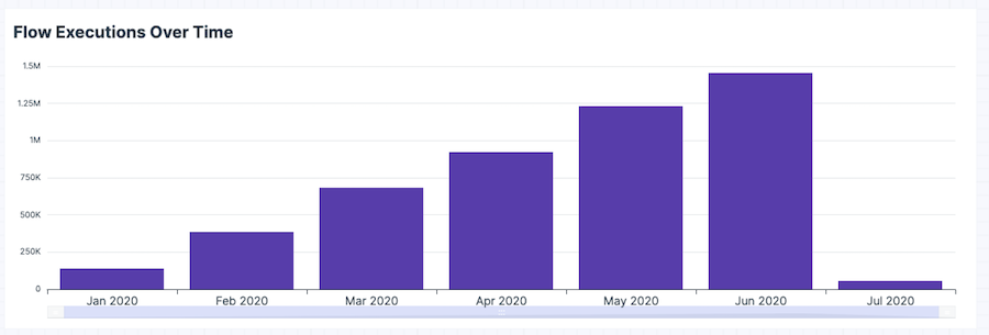
You can click and drag the ends of the horizontal slider bar to adjust the graph’s range.
You can use the following icons to manipulate the data in the graph.
| Icon | Description |
|---|---|

|
Maximize |

|
Drill up to the top from the resolved aggregation period. |

|
Drill up from the resolved aggregation period. |

|
Drill down from the resolved aggregation period. |

|
More options. |
Top Flows by Execution Count
Top Flows by Execution Count displays your most used flows, determined by how many times a particular flow was used compared to other flows. Click and drag the ends of the vertical slider to adjust the graph’s range.
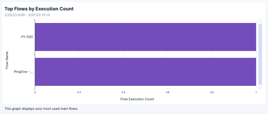
The default data metrics are grouped by flow name and list each flow’s execution count. Hover over a data point in the graph to view more specific information for that point.
Click the Sort (![]() ) icon to change the order of the graph bars.
) icon to change the order of the graph bars.
Connector Executions
Connector Executions displays the total number of connector executions for the selected time period.
Connector Executions Over Time
Connector Executions Over Time displays the number of connector executions per day for the selected time period. Hover over each bar to view more specific data points.
You can click and drag the ends of the horizontal slider bar to adjust the graph’s range.
You can use the following icons to manipulate the data in the graph.
| Icon | Description |
|---|---|

|
Maximize |

|
Drill up to the top from the resolved aggregation period. |

|
Drill up from the resolved aggregation period. |

|
Drill down from the resolved aggregation period. |

|
More options. |
Top Connectors By Execution Count
Top Connectors by Execution Count displays your most used connectors, determined by how many times a particular connector was used compared to other connectors. Click and drag the ends of the vertical slider to adjust the graph’s range.
The default data metrics are grouped by connector name and list each connector’s execution count. Hover over a data point in the graph to view more specific information for that point.
Click the Sort (![]() ) icon to change the order of the graph bars.
) icon to change the order of the graph bars.
SDK Flow Executions Over Time
SDK Flow Executions Over Time displays the number of flow executions run using the SDK for the selected time period. Hover over each bar to view more specific data points.
You can click and drag the ends of the horizontal slider bar to adjust the graph’s range.
Learn more about the supported SDKs in Launching a flow with a Ping SDK.
Flow Executions by Integration
Flow Executions by Integration displays a pie chart of the execution methods used in your environment. Hover over each section to view more specific data points.
Custom Analytics
Custom Analytics displays flow results from the Flow Analytics connector.
The Flow Analytics connector lets you log a particular outcome within a flow, such as a login success or an OTP failure. You can use multiple instances of this connector to log the possible outcomes of your flows.
Outcome Analytics
The Outcome Analytics tab lets you view data about a selected flow’s outcomes over a specified period of time. You can select the following parameters:
-
A period of time within the past 180 days. The default period of time is Today.
-
A flow with at least one Flow Analytics connector. The default flow is the first valid flow in the flow list.
-
Up to five outcomes defined by Flow Analytics connector instances. The default outcomes are the five most common outcomes today.
The occurrences of each outcome are then displayed on two graphs:
-
Outcomes Over Time: A line graph graph showing each outcome over the selected time period.
-
Outcome Distribution: A pie chart showing the relative occurrence of each outcome.
You can hover over each graph to see the outcome counts for a specific date or outcome.

Flow Analytics
The Flow Analytics tab lets you view data about a selected outcome in multiple flows over a specified period of time. You can select the following parameters:
-
A period of time within the past 180 days. The default period of time is Today.
-
An outcome identified by the Flow Analytics connector. The default outcome is the most common outcome.
-
Up to five flows that contain the specified outcome. The default flows are the first five in the list of available flows.
The occurrences of each outcome are then displayed on two graphs:
-
Flows Over Time: A line graph graph showing the occurrence of the outcome in each flow over the selected time period.
-
Flow Distribution: A pie chart showing the relative occurrence of the outcome in each flow.
You can hover over each graph to see the outcome counts for a specific date or outcome.
Current dashboard functionality notes
Review the following known issues and limitations regarding the current release of the PingOne DaVinci dashboard:
-
When making a chart full screen, the axis labels might not appear. Use your browser’s zoom in and out functionality (Ctrl + and Alt +, or Ctrl - and Alt -) to have them redrawn correctly.
-
The Drill up and Drill down features are currently disabled.
-
PingOne DaVinci does not support having the console open to different environments in separate browser tabs. The environment context can be mismatched when the user manually refreshes the page.
-
Top Flows on the Custom Analytics dashboard is only shown for customers who were active before March 9, 2023. This is so that they can see their historical data. Newer customers don’t see this chart, and the Top Flows on the main dashboard contains all of their data.